
YORKTON - With Monday being National Day for Truth and Reconciliation the Saskatchewan Roughriders have unveiled a new logo design to mark the day.
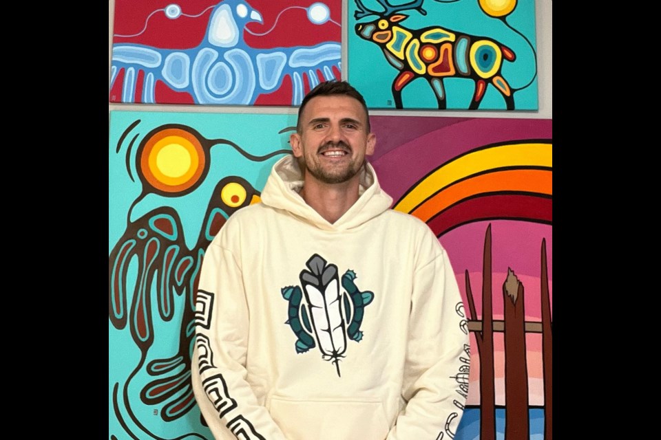
The logo has been designed by Chris Chipak of Red Pheasant Cree Nation (Treaty 6).
Chipak said he was happy to take on the project especially since he was given a lot of leeway in coming up with the design.
“It kind of was see what you’ve got Chris,” he said, adding “. . . I had the first sketch a couple of days after we (he and the ‘Riders) talked.”
So Chipak said he did some sketches – later getting the nod of approval from elders – and the Roughriders liked the initial work.
The team basically saw the initial ideas and quickly green-lit the artist to start colouring it, Chipak told Yorkton This Week.
“They bought into it right away ... I was so excited . . . Absolutely let’s do this,” he said.
The real work as artist came when Chipak went to add colour. He said it was a challenged to get everything in the logo to pop with only four greens.”
The bison was especially troublesome initially looking like a “green blob” until Chipak got the shadings just right.
For Chipak it was a sort of dream assignment which ticked a number of boxes.
While admitting as a teacher in Saskatoon he likes to get outdoors in summer and doesn’t watch a lot of CFL until fall, he quickly checks in on the Riders and follows them down the stretch to the playoffs once school is back in session.
“I love football,” offered Chipak. “. . . I still remember the history of the 13th fan as a kid.”
So as a football fan the logo creation was fun.
As an aboriginal artist the effort took on greater meaning.
“I had a lot to live up to with this logo,” he said.
Chipak said when he thinks of Rider Nation in general he recognizes a collective spirit in support of the team, and he hopes they will embrace the logo and what it means in a similar fashion.
“My goal has always been to have my work leave a story, even when art can’t be seen the stories carry on. My focus on this piece was to promote the importance of the land and the beauty of the prairies,” Chipak said in a Roughrider release. “I hope as this logo is revealed it provides healing, hope and inclusion to all. I wanted this to be a timeless logo that heals us from the past, make us feel in the present, and gives us hope for a better future.”
![]()
According to Chipak, the logo conveys deep cultural meaning through all of its elements. The artist was inspired by the Treaty 4 flag to incorporate the Buffalo, which embodies the spirit of the Saskatchewan prairies and represents the respect for the willingness to offer every part of itself to sustain the lives of others. A connection between the land and the people. The sun emphasizes the Treaty promise and it signifies the interconnectedness of all things to represent the collective effort that is essential to reconciliation. The ribbon-like skyline pays tribute to the province’s identity as “the land of the living skies” and traditional ribbon skirts. The river’s (kisiskâciwan) eight circles symbolize the number of native berries of Saskatchewan. The two upright feathers evoke a sense of respect and honour, while representing Two-Spirited people, acknowledging their roles as guides and their diverse perspectives within the community. Feathers are a powerful symbol of the highest form of respect.
Chipak said he hopes ultimately that the logo conveys a positive emotion.
“I wanted to create a story that after you see it, you don’t have to see it again to still feel it,” he said. “I’m hoping this is the beginning of something good.”
Chipak said he looks forward to seeing the logo on the helmets and in the stadium.
“I’ll be good to go after that. It will fill up my bucket for sure,” he said.


