
REGINA - The Saskatchewan Roughriders are thrilled to unveil a brand-new alternate look, inspired by Rider Nation.
The new, alternate brand includes a dynamic, modern logo and bold, new uniforms that will be worn twice during the 2024 season: our Green is the Colour Game on July 19th and Fan Appreciation on October 26th.
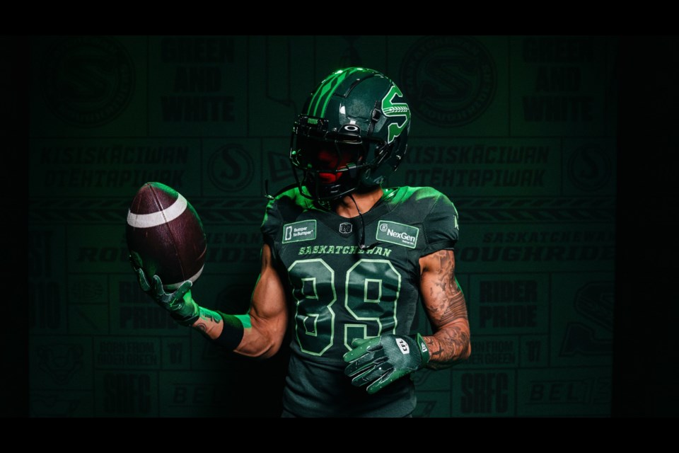
“After several years of planning and perfecting, we are incredibly excited to be unveiling these beautiful Rider Nation Alternate Uniforms and Alternate Logo to our fans,” said President and CEO Craig Reynolds. “Both were created with Rider Nation in mind and inspired by the province of Saskatchewan, pulling colours from our team, our landscape and our skies.”
“We hope our fans will wear the alternate jersey and logo with pride, as we will, alongside the retro, home and away jerseys we all know and love.”
About the Rider Nation Alt Logo
Obsidian green – as found in the outline of the logo, is the primary colour of the alt uniforms and embodies a toughness found in the shadows. It is the darkest shade of green available before it turns to black.
Rider green – as found in the bottom portion of the “S” is a shade that speaks of resilience, without saying a word, and reflective of a place and people renowned for their tenacity: Saskatchewan.
Emerald green – as found in the top portion of the “S” is reflective of the fireworks that explode above Mosaic Stadium and the Northern Lights that glow above the Land of the Living Skies.
The Wheat Spike – as found in the middle of the “S” is the piercing sheaf that pulls all these shades together helping join both sides of the “S” in an infinite loop. This spike, long a symbol of Saskatchewan and its people, is topped by a 13th kernel paying homage to the 13th man and our incredible fan base.


